
Photoshoot plan
The genre i am focusing on – Still life
Two photographers that inspired the shoot – Two photographers that inspired my shoot were Jenny Van Sommers and Bea Lubas.
Jenny Van Sommers
Jenny Van Sommers is a photographer with many years of experience in her field of photography. She was born in Australia and now lives in Sei in London as a London-based still life photographer. She also travels to many places and frequently visits the US and France. Her clients include Ponystep, French, British, German And Chinese Vogue, Dazed And Confused, Another Magazine, Pop And 10, Apple, Audi, Nike, Sony, Nokia, Mercedes, Jil Sander And Stella Artois. Jenny Van Sommers Style is mostly a work of art which is still life. Her photographs are popular and unique with her using strange mostly geometric shapes to give her alluring subjects a surreal twist. Her style is very simple with not that much going on which can give the photograph a very modern and whimsical feel. When using a lightbox or other tools that Jenny uses to take pictures of objects, she would have different lighting for each one. Some different colours and some to make a shadow, this makes the objects look even more fantastic.
Below shows examples of her work
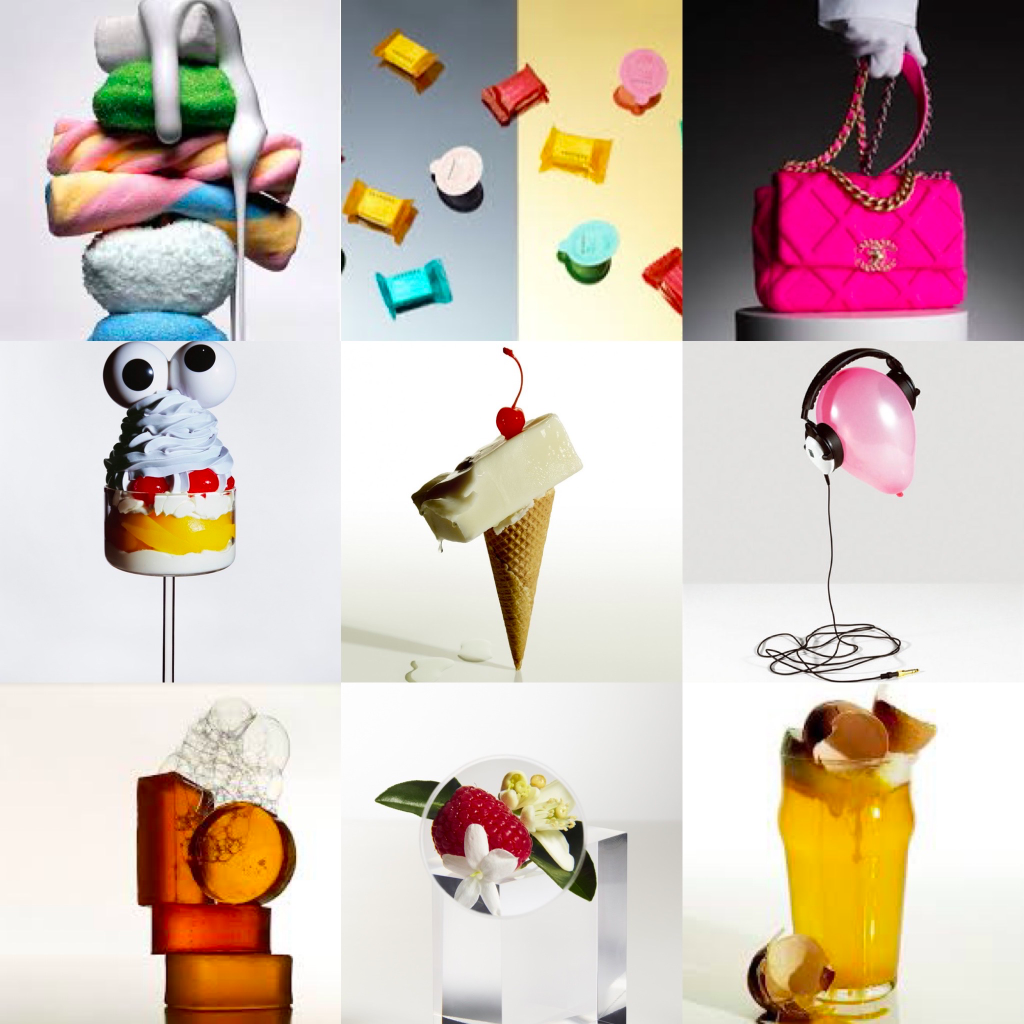

Commenting on Jenny Van Sommers work
The above shows lots of examples of Jenny Van Sommers work, as I can not comment on all the amazing work Jenny Van Sommers has done I am going to chose 1 photo to comment on (which will be shown below).

VOGUE SOAP
This photograph (above) is titled Vogue Soap. In the photograph, you can see two cylinder blocks of soap standing on top of each other with another cylinder piece of soap standing upright on the right with a rectangle piece of soap on the left. Above the pieces of soap, bubbles are ascending up towards the top of the frame of the photograph. I believe the bubbles are used to show the lathering of soap when it is used which I really cool to show the function of soap. The colours within the photograph are very vibrant with strong yellows, oranges, and reds in the soap and a multi-array of colours within the bubbles.
There are also lots of different dark, light, and transparent elements throughout the pieces of soap that create different tones within the image-enhancing the depth of perspective within the photograph. I like the textures within the soap because it gives the image a more smooth and clean structure with character than just plain old soap. The lighting seems to be hard and artificial due to the warm coloured soap being shown so boldly with a bit of exposure being shown in the reflection of the soap.
In my opinion, I like the photograph because of its composition, textures, and colours that are shown throughout the photograph to produce a vibrant and dynamic still-life image.
Bea Lubas
Bea Lubas grew up in a little town in the south-west of Poland . At the age of 20 she made the courageous decision to go to England and to set off for an adventure of a lifetime. She moved to find herself and to discover who she is and what makes her heart beat faster as well as to find a home. Which to Bea Lubas is not a place, but a feeling inside: the happiness with who she is. For Bea, it took a lot of hard work, tears, and hours of talking to people much wiser than herself to hear lessons and tips for the future. Only then did she realize that “it” was always inside of her, the love of food, the love of creating with it, and the love of capturing it on camera with her amazing photography skills. Her clients include Waitrose, Clarence Court, Vitamix, Royal Doulton, Madeleine shaw, Vegetarian Times, and Quaker. On her blog beatalubas.com, she has lots of tips for food photography like styling food, backgrounds/lighting, and many more.
Below shows examples of her work


Commenting on Bea Lubas’s work
The above shows lots of examples of Bea Lubas’s work, as I can not comment on all the amazing work that she has done I am going to choose 1 photo to comment on (which will be shown below).

Frosty Grapes
(Could not find actual name)
This photograph is titled Frosty Grapes (could not find actual name). In the photograph, you can see bunches of beautiful , mouth watering purple grapes covered in a thin coat of icing sugar. They are spread over a surface with a dusty white/blue colour matching the colours of the grapes after the icing sugar was poured on. The colours within the photograph are very gentle and eye catching due to the simple yet matching colour scheme of blues , purples and whites
There are also lots of different pastel, light and satisfying elements. For example, all the light and pastel colours give the photo a cool tone, to add because of the thin and perfect coat of icing sugar on the grapes it gives the impression that the grapes where left in the snow giving them a frosty and whimsical effect. Throughout the photo you can see the different tones within the image such as the grapes with icing sugar which is light vs the natural dark and bold purple grapes enhancing the depth perspective within the photograph. The lighting seems to be soft , natural and cold due to the light winter effect that the photo has. I also like the textures.
In my opinion, I like the photograph because of its light, cold, and aesthetically pleasing colour followed by the smooth, gentle texture. These qualities are shown throughout the photograph which creates a stunning and bold still life image.
Concept: What i intend to do in my still life photoshoot is firstly use weird placed objects to make an interesting aesthetically pleasing photo like Jenny Van Sommers. Secondly i would make food like Bea Lubasand catch it on camera making it look mouthwatering and delectable. Below shows 2 mood boards illustrating my ideas:


Equipment and Location: I need to use my D3500 Nikon camera to take my photos. As my photos are still life i would need some objects around the house for my Jenny Van Sommers inspired photos and for my Bea Lubas inspired photos i will have to make the food for the photos myself which will be fun but todo this i must check if i have the ingredients or my food photos wont exist. These photos will be taken in my kitchen and to disgiues my kitchen background i will use sheets , towels and clothing if i want it covered.
Lighting: I believe i will use natural to begin with however if my photos are not coming out as sharp then i will use an editing app on my phone to fix it.
Models and objects: Objects i will use will vary from food like cake , fruit and smoothie bowls to everyday objects like soap , books , bottles and other weird objects i can use. As i am doing food and peculiar still life photography i believe examples like the ones above are good objects to use in my photos.
Composition: I am really not sure for the arrangement for all of my photos as both Bea Lubas and Jenny Van Sommers place there objects and food in many different ways. Like face upwards , side views , stacked on top of each other ect. So i think i will expiriment with the placement and whatever position looks right i will use it in the photo.
Risk assessment
| What is the hazard? | Who and what is at risk? | What is the risk level (low , moderate, high)? | What will you do to minimize the hazard? | Who to contact in case of an emergency? |
Objects falling and making a mess | The objects i am using and the people around me | High | Put the objects i am using on a low surface and to be careful placing them in the right position for the photo. Also going to have paper towels , broom and cleaning spray ready incase of an accident. | Call my parents |
Dropping or scratching camera | The camera and the people around me | Low | Where the camera strap over my neck for support and always holding it for extra support. I am also going to keep the lens cap on until i need to use my camera to avoid scratching it. | Call my parents |
Tripping over objects and other stuff in my surroundings | The objects , camera and the people around me | Moderate | I am going to be mindful about where everything is and create a bigger space by moving all objects and other stuff out of the way while the photos are being taken. | Call my parents, if serious call emergency number |
Composition – How to use it in my photoshoot
When we are talking about composition we are talking about how the elements of a photo are arranged. A composition can me made up of many different elements, or only a few. It’s how the artist puts those things within a frame that help a photograph become more or less interesting to the viewer.A good photograph will take many different parts and combine them into an aesthetically pleasing whole. Composition is how an artist tells a story within the confines of a single frame , intriguing the viewer.
Dynamic Symmetry
Dynamic symmetry is used to arrange elements in the frame using a dynamic symmetry grid. This is a series of lines that run horizontal, vertical, and along diagonals . They eventually dissect the rectangular shape of your frame to see the composition of the photo and to see if it’s correct or not. It is also used to promote the continuity , flow and balance of the artists work. It is a method used by all kinds of artists over thousands of years since ancient times. Below shows the steps on how to make the grid

Practice photos


Contact sheets
| Photos | Notes |
 | For my first macaroon photo it was a disaster. Firstly i wanted the macaroons to be stacked on top of each other however as you can see from this first photo the macaroons fell down as no structure was put in. To add this photo is really blurry so i checked my camera and saw that the settings were all messed up including the ISO , shutter speed, aperture and more, so i re-set the settings to improve the look and sharpness of the next photo. |
 | For the second photo i believe it was slightly better. This is because i inserted a tooth pick between the macarons to increase structure which is why the macaroons are now neatly stacked on top of each other. Furthermore because i re-set the settings in my camera this time there is no blurriness in the photo. However this certain image cuts out some of the macaroons at an odd angle.To add the macaroons are too close to the camera, overall making the photo look not neat and inaccurate. |
 | For the third photo i think it went well. The photo was neat and sharp and all macaroons were in the photo frame. However i think the stacked macaroons were too far away resulting in losing the beautiful details of the macaroons. Something to notice from the last photo and this photo is that there is some exposure from the sunlight in the corner of the photo, so for the next photo i was sure to close the blinds. |
| For my final macaroon photo i think it was very successful. The macaroons were in the centre of frame, the settings were correct and the macaroons were the perfect distance from the camera making the details of the macaroons look really sharp. However i did have to edit in some saturation and brightness as there was not a lot of light in any of the other pictures but i think it really makes the macaroons look more vibrant and bright. |
| Photos | Notes |
 | In this first brownie photo i wanted todo a side shot as i thought most of my practice shots for the other practice pictures where going to be birds eye view shots (picture is taken over the top of the object) or a centre shot (taken from the front e.g macaroon picture). However the side shot did not go well, not only did it look very unnatural somehow it looked more darker because of the brownie at the bottom being a lot more darker than the top producing more darkness to the photo. So the first photo did not go well. |
  | For the second brownie photo it didn’t go so well either. I changed the position of the shot for the brownie to a birds eye view shot. This way it’s a bit lighter and the texture can be shown clearly in the photo. However the photo came out a bit blurry and the white cloth was showing in the background, due to this the photo overall did not come out great. |
 | For the third photo i tired to get the shot completely in the centre trying not to show the white cloth in the background, so i tried to lean over the brownie as much as possible to get a clear birds eye view centre. Sadly i did not get the rest of the brownie in the picture and by doing this it cropped the image. Other than that the image was good as i can see the clear , strong texture of the brownie. |
| My final brownie picture came out perfect. I was able to lean further and get the perfect centre birds eye view shot, which really displays the brownie well. However the natural light in all the practice photos made the brownie look dull so i added some sharpness , shadow and saturation, making it very bold and overall a mouth watering photo. |
| Photos | Notes |
 | For my first weird face milkshake photo i wanted it to look like the milkshake was alive hence the face, however i placed it where the whipped cream is and it blocked the volume and height it added to the photo. There was also lots of exposure being shown in the sides of the photo making it a bit bright and untidy. So all in all this image was not that great. |
 | My second weird face milkshake turned out fine. I placed the face centre on the glass which was a better decision however the image came out looking too clean and just looking a bit weird. There was still exposure at the sides of the photo which i could not fix because the shutter was broken so i decided that with my final image i will crop, darken and saturate it to cut out the exposure plus the brown and bit of white in the background and making the shot more dark and more powerful colour wise. |
 | For my third weird face milkshake photo i decided to add some sort of composition to make the photo more interesting and messy. I was able to add whipped cream dripping from the sides of the glass, as well as changing the angle of the face, to act as the face was licking the whipped cream off the glass. However even though the photo was looking better there was still the same problems from the last 2 photos being shown in this photo. |
| My final photo came out great. Even though the milkshake face was a weird concept i really liked how the final image turned out. The composition looks great and the saturation, shadow and cropping of the photo makes the milkshake look more bold and eye catching. Including the removal of the exposure and white and brown in the background. Even the glass looks more sharp and clear. On the whole this was an enjoying and striking final image. |
| Photos | Notes |
 | |
 | For this first photo I came up with a concept to do with a message like health so I focused on the teeth and how you must keep them healthy. So I used the toothbrush and toothpaste to represent a knife and fork and the plate of sweets to represent the harmful and damaging foods to your teeth like sweets. The idea is great but sadly the quality of the photo does not add up, there is unwanted exposure in the background and the camera was tilted not getting a centre bird’s eye view image, because of this some of the brown table is being shown in the background making the photo overall look disordered . |
 | As for my second plate full of sweets picture yet again unwanted exposure and unwanted background was being shown in the image. Which are the exact critiques from the first photo. It gets worse as some strands of my hair are being shown in the unacceptable photo, as this makes the photo look unclean and unprofessional. Fortunately I believe this photo was more centred than the first and more straight and accurate so improvement is showing. However in total this image was a bit of a let down. |
| The final plate full of sweets picture is really superb not only is everything straight and centred but also equal. None of the excess unwanted backgrounds is showing from the last two pictures and there is no unwanted exposure as well. The picture is bright and full of colour. I really like how this image came together however if I could improve on one thing I would like more shadows in the picture. |
Feedback and responce to feedback on practice photos
“Your initial images are absolutely excellent, especially the one with the glass as this is the one most difficult from a technical point of view and you have achieved an excellent result so far you are still missing a couple of images as you need six final outcomes so please keep experimenting bearing in mind that it is a still life so do not be afraid to add props like a table cloth, kitchen tools, flowers, etc. In your next shoot as you have seen in the mood board or in your second photographer that you have researched I would recommend “cleaning” the pictures you have taken so far using GIMP so that you delete the small spots or crumbs to give the photographs a more “clean” aspect. It’s just to achieve a super professional image. If you use the clone tool this could work. You can find how to use it in this link:https://docs.gimp.org/2.10/en/gimp-tool-clone.html. You would need to take a sample of the black background to cover the white spot.”
I think this feedback is really helpful and I agree with all of it. I will definitely keep on experimenting with my photography and practice using props and other objects in my photos to produce a bigger variety of photographs. I like the idea as well of “cleaning” my photos to enhance the quality of the photo and producing a solid background colour as that is my intention in most of my photographs. So I will be looking into the https://docs.gimp.org/2.10/en/gimp-tool-clone.html link as well. Overall I really like the feedback as it shows what I need to improve on and furthermore how I can improve my photography.
Final photos


Contact sheets
| Photos | Notes |
  | For this first coffee and macaroon photo, I wanted to focus on the look and aesthetic of the photo. I used a cup of coffee, coffee macaroons, brown paper in a glass to imitate coffee, a tea towel and coffee granules. I thought this photo looked great but maybe a bit too over the top and a bit blurry. Furthermore it is dark outside which reflects in the dark lighting of the photo. |
  | For my second coffee macaroon photo I took away the cup of coffee and one of the macaroons from the last photo to make it look less over the top which worked. In addition the photo is more zoomed in making all the probs and objects look more bold and less blurry. However the image is still dark and the photo is not in the white frame background making it look a bit messy. |
  | For my third coffee macaroon photo all the objects and props are centered and are within the white background. I also added in a macaroon I took out in the last photo to make the amount of macaroons on the tea towel an odd number (more aesthetically pleasing). In addition the tea towel is more folded up and less spread out which makes the photo look more neater. However the photo still looks dark including the colours of the objects and props used in the photo. |
| For my final macaroon photo I really zoomed into the photo which was great as it made all the objects and props look bigger and made the image look less blurry. Furthermore I edited the photo to increase the saturation, vibrance and brightness which really contributed well to the image. The colour looked more vibrant and the photo looks less dark. In addition I also slightly cropped the photo to get rid of the unwanted background. Overall I really like my final coffee macaroon photo and I believe it turned out well. |
| Photos | Notes |
  | For my first pink drip photo I wanted to see what angle I wanted to take the picture and I chose a birds eye vi ew ( top view) just because its a bit different and I thought I would show of the cake well. however even though the picture looks nice there is some unwanted exposure in the photo and furthermore I don’t think the birds eye view angle shows of the entire cake except for the top. |
  | For my second pink drip photo I used a different camera angle to try and show of the whole cake. I like this angle as it shows of the rest of the cake but it could focus a bit more on the top as most of the decoration is located there. Furthermore there is still unwanted exposure and the photo looks a bit dark making the colours on the cake look dark, dull and uninteresting as well. |
  | For my third pink drip photo I tired a third camera angle just to try and show of the top of the cake as well as the sides of the cake so overall I think this angle is the most successful. There is a bit of unwanted exposure in the corner so next time I should close the blinds when photographing so the light doesn’t come through the window. However the photo is still dark making the colours look dull and less vibrant. |
| For my final pink drip photo, I zoomed in to the cake and cropped the image making the cake look bigger hence making the details and decorations on the cake look bigger. I also edited the photo just to add some shadow , saturation and contrast which really makes the photo stand out more. In addition cropping the photo allowed me to get rid of any unwanted exposure. Overall i really like how the image came out however maybe next time i should try using natural light or a ring light instead of editing it on to the photo as it can come out as unatural. |
| Photos | Notes |
 | My first half cut fruit and vegetable photo did not go that well. Firstly there is so much unwanted background being shown including the table, towel, part of my laptop and a small part of a lamp. In addition to the unwanted background being shown there is also unwnated exposure however i quite like the unwanted exposure as it flows over all the fruit and vegetables and acts as natural light. I also don’t like how zoomed out the shot is as it makes the fruit and vegetables look tiny, blurry and not that detailed. To conclude i am disappointed on how this photo turned out. |
 | For my second half cut fruit and vegetable photo i really liked how i zoomed in more as it makes the fruit and vegtables look bigger however i think it can be zoomed in even more. However i really don’t like how some fruit and vegetables are placed on top of each other and some aren’t so it makes the photo look not that clean. In addition there is a piece of my hair in the photo which is shown in the left hand corner of the photo so next time will be sure to tie up all of my hair. |
  | For my third half cut fruit and vegetable photo i liked how it turned out, the photo is slightly more zoomed in and my hair is know where to be seen in the photo however i think the photo could be more saturated just to make the colours and details of the fruit and vegetable stand out more. Furthermore i think some of the shadows are going over some of the fruit and vegetables making them look a bit to dark and hiding the details of the fruit and vegtables. |
| For my final half cut fruit and vegetable photo i really loved how it turned out. With editing i increased the saturation and brightness which really brought out the colour and detail of the fruit and vegetables. In addition i really like how the background has a light and dark contrast which really shows the shadow and brightness in the photo. Furthermore with editing i was able to crop the image to make the fruit and vegetables look even bigger. Overall i really like the photograph. |
| Photos | Notes |
  | For my first flowering green tea photo it didn’t go so well. Firstly i wanted the green tea drink to be surrounded by flowers however when i placed the flowers around the green tea drink it looked really messy. Furthermore the flowers and green tea drink were not in green background and showed some unwanted background. In addition the light i was using looked warm which made the photo look slightly yellow. However i liked how i used the hibiscus flower that is placed inside the green tea drink, as it goes with the more weird area of photography that i displayed on my mood board. |
  | For my second flowering green tea photo it was a disaster. Yes the extra plants and flowers are not creating mess and have been removed but there is so much unwanted background due to me zooming the camera far to out which ruins the solid background colour effect i wanted to go with. I also got rid of the warm lighting however my photo now has no lighting and is way to dark hiding the colour and details of the hibiscus flower and the green tea drink. |
  | For my third flowering green tea photo i turned on the lights to create the warm lighting effect and my photo still looks too dark. This is probably because the window is open and the sun has set so this could be the reasoning for the awkward lighting. In addition because of the light the green tea drink and the hibiscus flower crates some shadow onto the green background but it ruins my idea for a solid green background, however by editing the photo i am sure that i can remove the shadow and enhance the vibrance and brightness of the photo. |
| For my final flowering green tea photo i am happy with it. By editing i was able to increase the brightness of the photo and increase the saturation showing the detail and colour of the green tea drink and the hibiscus flower. Furthermore i was able to remove the shadow in the photo and create a solid and even green colour for the background. I also cropped this photo which also allowed me to achieve the background i wanted. By using more brightness and exposure i was also able to get rid of the awkward lighting that i was struggling with. Overall i really like this photo and i am really happy with it. |
| Photos | Notes |
 | For my first bubbly perfume photo i wanted the photo to look like someone was hand washing the perfume to go with the weird and beauty side of my past mood board. However i wasn’t quite sure about using bubbles so i wanted to see what the photo would look like without the bubbles, but i think it looks to plain and to boring so i think the photo should have bubbles. Furthermore there is some unwanted background because of the angle i was taking the photo which made the photo look uneven. In addition the perfume is not centred and some of the arm of my model holding the perfume is not being shown. |
  | For my second bubbly perfume photo i started to use bubbles however the bubbles in this photo are way to liquidy and not as foamy and stiff as i wanted them to be. In addition i wanted to see if i could use rainbow bubbles however in this photo it shows that blue was too dominate in the making of the bubbles so in the photo is just looks weird. I like though how my models arm is now in frame and the photo i have taken is centred however the photo looks slightly blurry. |
  | For my third bubbly perfume photo it looks so much better then the last two photos. I used more stiff and foamy bubbles which created the washing up effect i was going for and the photo looks less blurry because i re set the settings in my camera and to be safe i also decreased the level of ISO from 150 to 65. The perfume, bubbles and my models hand/arm is in frame and the photo is centred. However to improve this photo i would like the ariana grande name in the front of the perfume to be more bold and there to be more shadow and saturation of colour. |
 | In my final bubbly perfume photo i really love it. By enhancing the saturation and shadow it really brought out the colour in the perfume and the rubber gloves my model was wearing. Furthermore i added shadow and with the saturation it darkened the background to a more solid black colour. I also was able to bring out the ariana grande name in the front of the bottle and make it more bold. In addition i also sharpened the photo so it also showed the texture of the bubbles. I also cropped the image slightly just to make the props in the photo look bigger. In conclusion i really adore this image. |
| Photos | Notes |
 | For my first floating pink skin products photo it was a bit troublesome todo. I wanted some of the skin care products to be floating in the air to give the impression that they suspended in gravity. I did this by tying fish string to the jade roller and tying the remainder string to a cupboard handle. The photo is too dark and is not showing of the products and it is also not centred and is taken in a kind of birds eye view angle which is not the view point i wanted to take the photo. There is also unwanted background making the photograph look messy. The photo also looks empty so maybe i should use more products. |
 | In my second floating pink skin products photo i added in some face cream to be hung by the fish string to make the photo look more full and exciting. I also took this photo in the right view point ( front) and not birds eye view which shows of the products better. Even though the photo looks a bit more full there are still some problems with this second photograph. For example there is still unwanted background and the photo still looks slightly dark. I also moved the position of the lip oil but i don’t like how all the products are all so close together. |
 | In my third floating pink skin products photo i added more lighting by using a torch which created some awkward lighting but also some nice shadows on the pink background. However i wanted a more solid pink background and the photo still looks very dark. Due to the darkness it also doesn’t show the colours or details of the skin products. There is also still unwanted background so to fix this problem i think i will crop the photo when editing. Furthermore i also moved the lip oil more to the left which spreads out the products a little bit more and less clumped together. |
 | For my final floating pink skin products photo i really liked how it turned out. I cropped the photo to remove the unwanted background and while editing i added more brightness and exposure to fix the weird lighting and brighten up the photo. Doing this also creating a more solid background which i wanted and it also shows more of the colours and details of the products. I also edited out the fish string and it now looks like the jade roller and face cream are floating in the air. The photo is also centred and not in any sort of weird angle. However if i could change one thing i would probably add more skin care products as the photo still looks a little empty. However other than that i love the aesthetic of the photo. |
